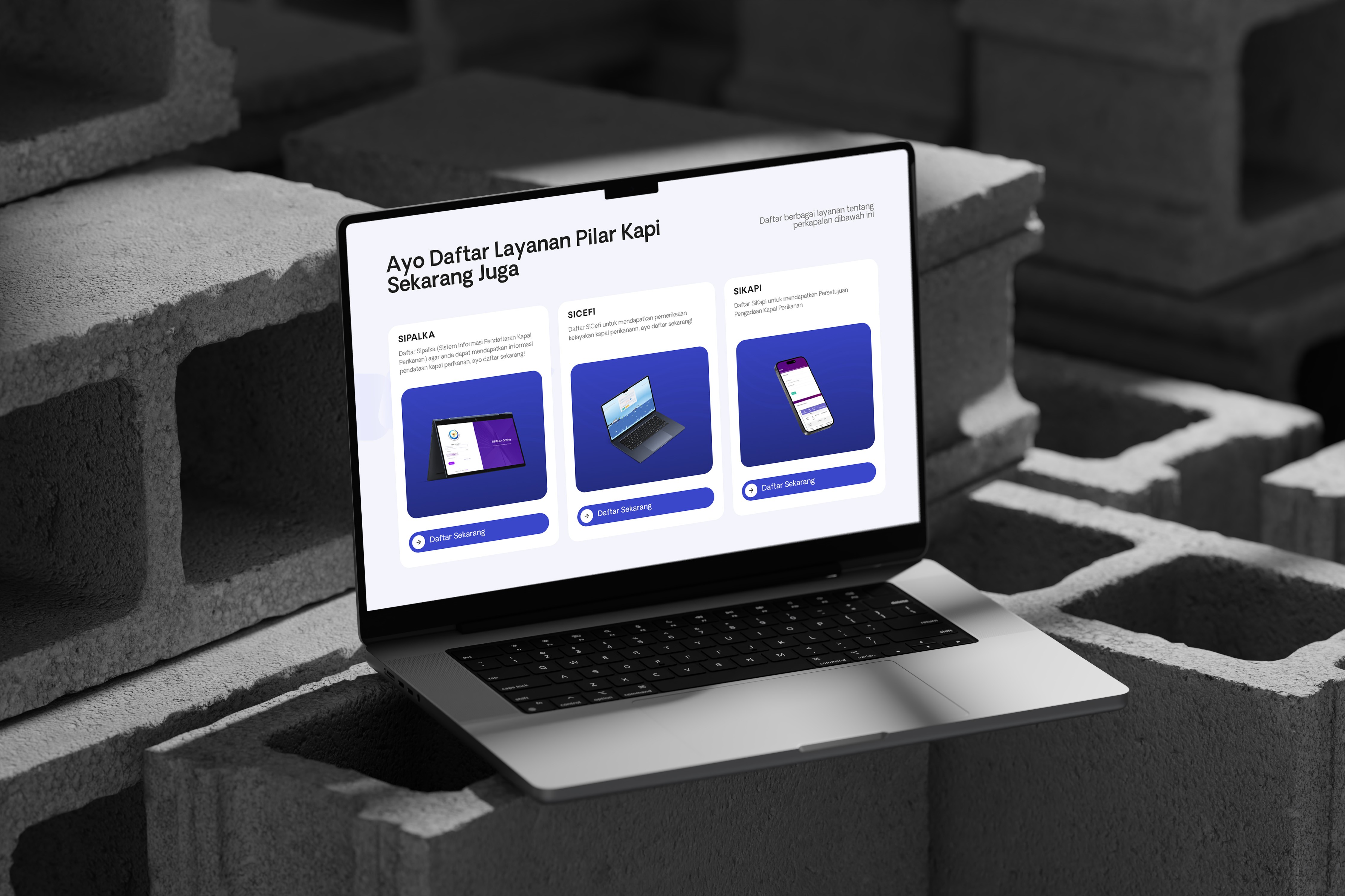
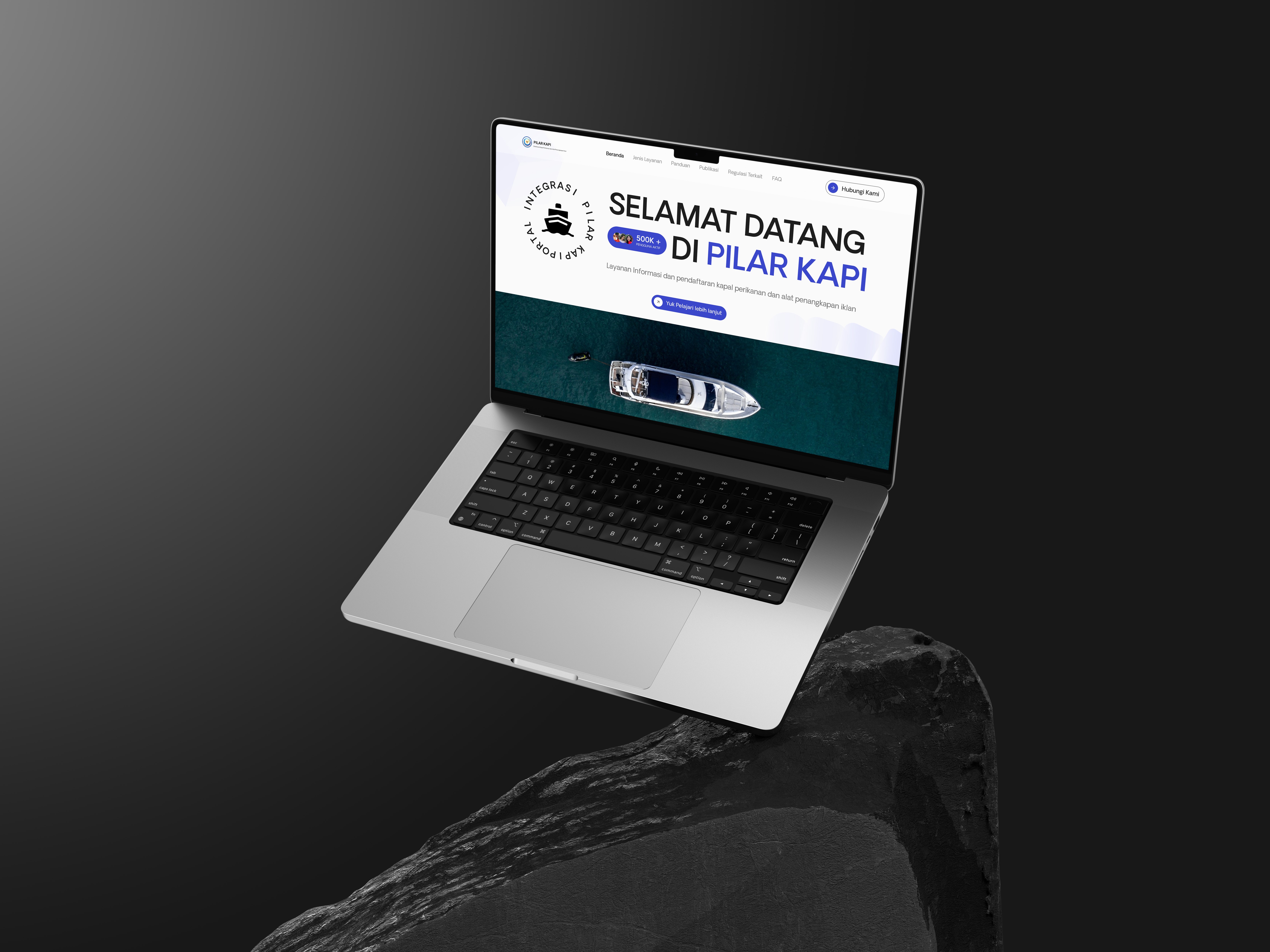
The website kapal.kkp.go.id is an official platform managed by the Ministry of Marine Affairs and Fisheries (KKP) of the Republic of Indonesia.
This platform provides comprehensive information regarding vessels used for managing Indonesia's marine and fisheries resources
Project Overview
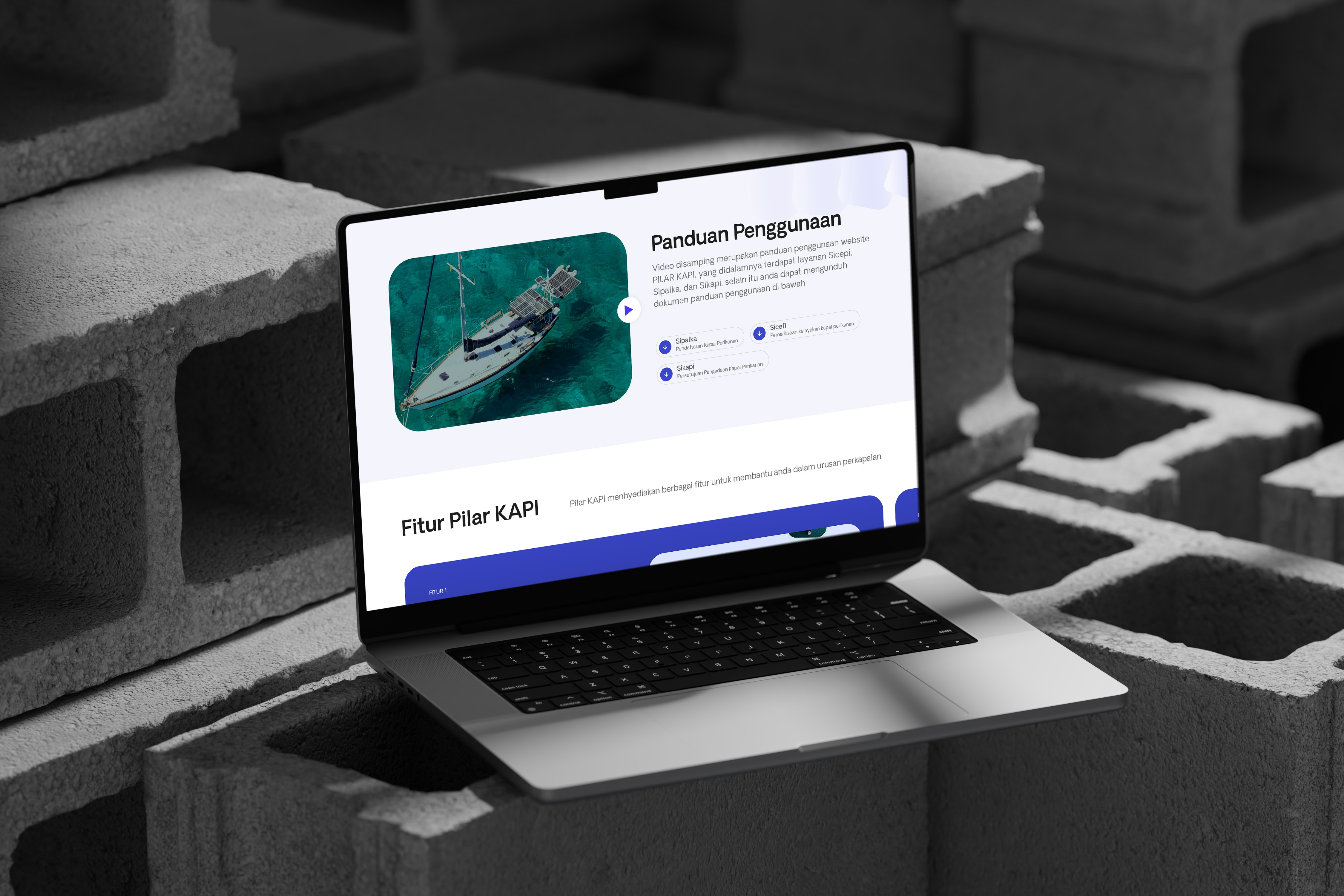
Kapal KKP (Ministry of Marine Affairs and Fisheries) operates a primary website for managing fishing vessel data in Indonesia. Before the redesign, the website faced several major issues:
Confusing user flow: Users often struggled to complete their tasks due to complicated navigation.
Unclear system: Information and features were poorly organized.
Outdated UI: The interface design lacked a modern and appealing look, reducing user trust.
Personas
To ensure the design solutions met user needs, we developed three primary personas based on interviews and user data:
Sari (Administrative Government Employee)
Age: 35
Background: Administrative staff responsible for processing fishing vessel licensing documents.
Goals: Efficiently complete vessel registration and licensing tasks.
Pain Points:
Difficulty finding relevant information on the website.
Time-consuming processes due to unintuitive navigation.
Budi (Fishing Vessel Owner)
Age: 50
Background: Fishing vessel owner who relies on the website for vessel registration and license renewal.
Goals: Ensure vessels operate without administrative delays.
Pain Points:
Difficulty understanding technical terms on the website.
Unclear step-by-step licensing processes.
Dina (KKP Policy Developer)
Age: 29
Background: KKP staff responsible for monitoring vessel data for policy-making.
Goals: Quickly and accurately access vessel data.
Pain Points:
Lack of an organized dashboard for comprehensive data views.
Scattered information across multiple pages.
Interview Results
We conducted interviews with key users to support the redesign process. Here is a summary:
Sari (Administrative Government Employee)
"I often feel confused about where to start when processing vessel licenses. A clear guide is very much needed."
"The website layout is too cluttered, making it hard to focus on one task."
Budi (Fishing Vessel Owner)
"The terms used on the website are sometimes too technical. I have to ask others for clarification."
"I wish there was a feature that clearly explains the steps I need to follow."
Dina (KKP Policy Developer)
"The data I need is scattered across different pages. An integrated dashboard would be much better."
"I need data visualization to quickly identify trends or issues."
Problem Statement
Based on user data and UX analysis, the key issues identified were:
Navigation and Flow:
Users struggled to complete tasks due to unintuitive navigation.
Information Clarity:
Disorganized systems and features caused user confusion.
Visual Design:
An outdated UI reduced the website's credibility.