IOT KIOSK UI Design for XYZ Bank
Imagine walking into a bank where long queues and confusion are replaced by an organized, efficient, and user-friendly system. This was the vision behind the OT KIOSK project for Bank XYZ—a solution designed to revolutionize the way customers interact with banking services.
The Challenge
Bank XYZ wanted to address common pain points in its branches: lengthy wait times, disorganized queues, and frustrated customers. The goal? Create an intuitive and efficient queuing system that enhances both customer satisfaction and operational efficiency.
Our Approach
To tackle this challenge, we designed a cohesive system consisting of four key components:
KIOSK
DISPLAY
WEB CALLER
REPORTING MODULE
Let’s dive into the journey of each feature and how they contribute to the system.

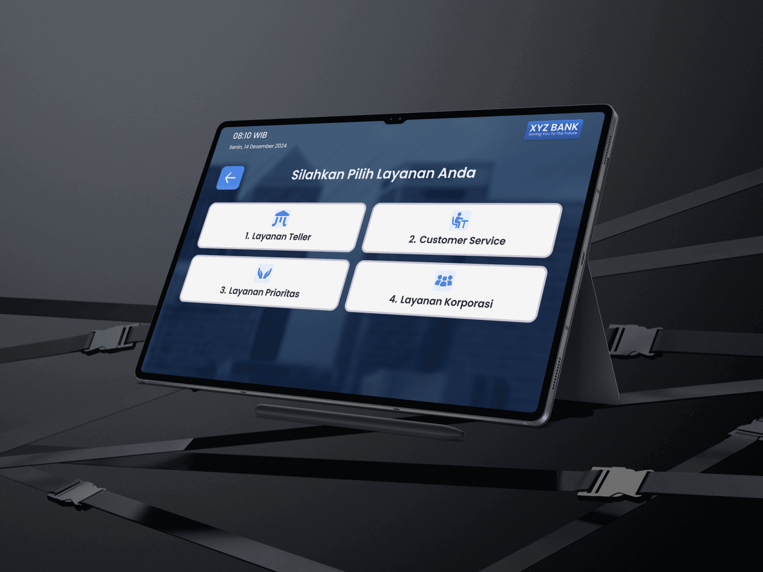
1. The KIOSK: A Welcoming First Touchpoint
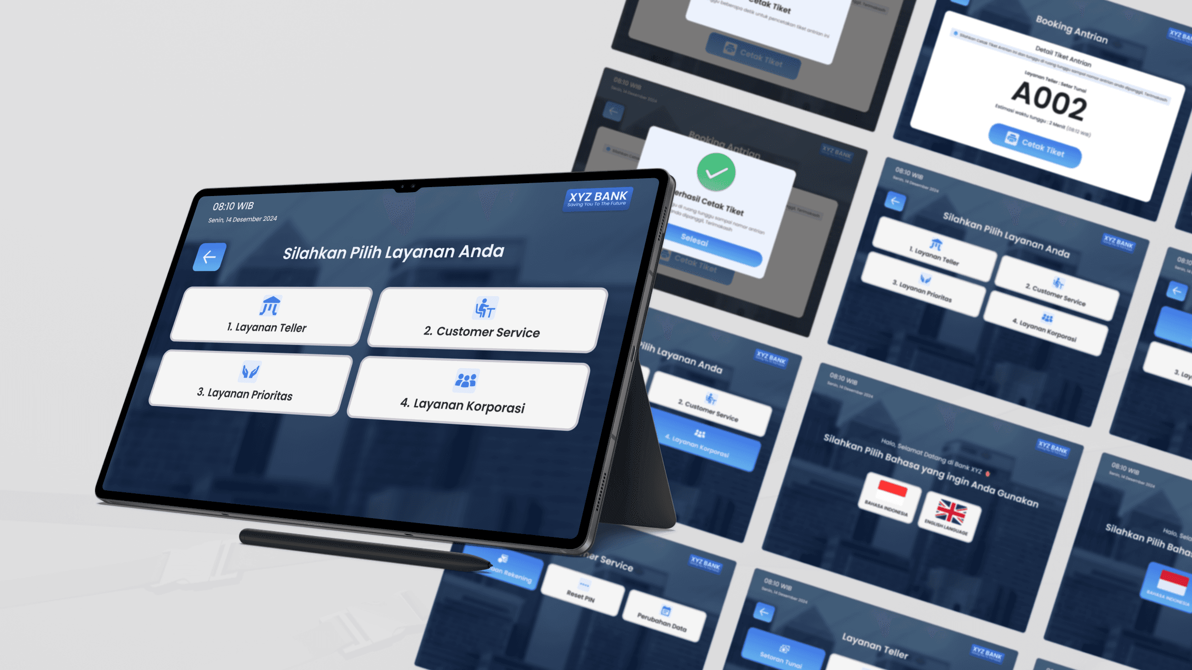
When customers enter the branch, the kiosk greets them with a user-friendly interface.
🔍 What does it do?
Guides customers to select their desired service.
Collects necessary details.
Prints a token for their queue.
✨ The Impact
No more manual ticketing or guesswork—customers immediately feel a sense of clarity and control.
2. The DISPLAY: Real-Time Updates at a Glance
Once customers are in the waiting area, the display system takes over.
🔍 What does it do?
Shows real-time queue status.
Displays token numbers and their assigned counters.
✨ The Impact
An organized and informed environment eliminates the anxiety of missing your turn.
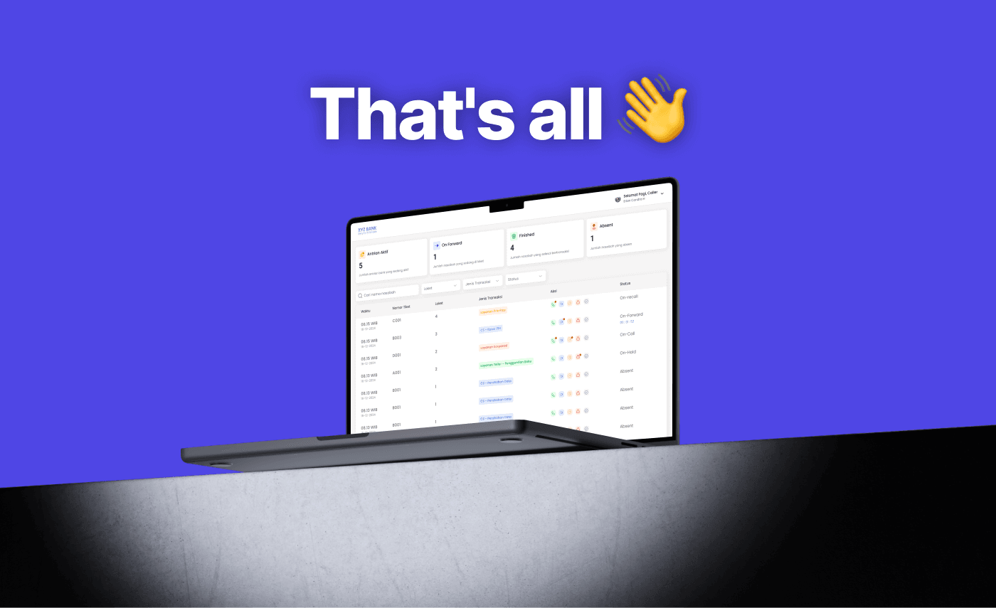
3. The WEB CALLER: Powering Staff Efficiency
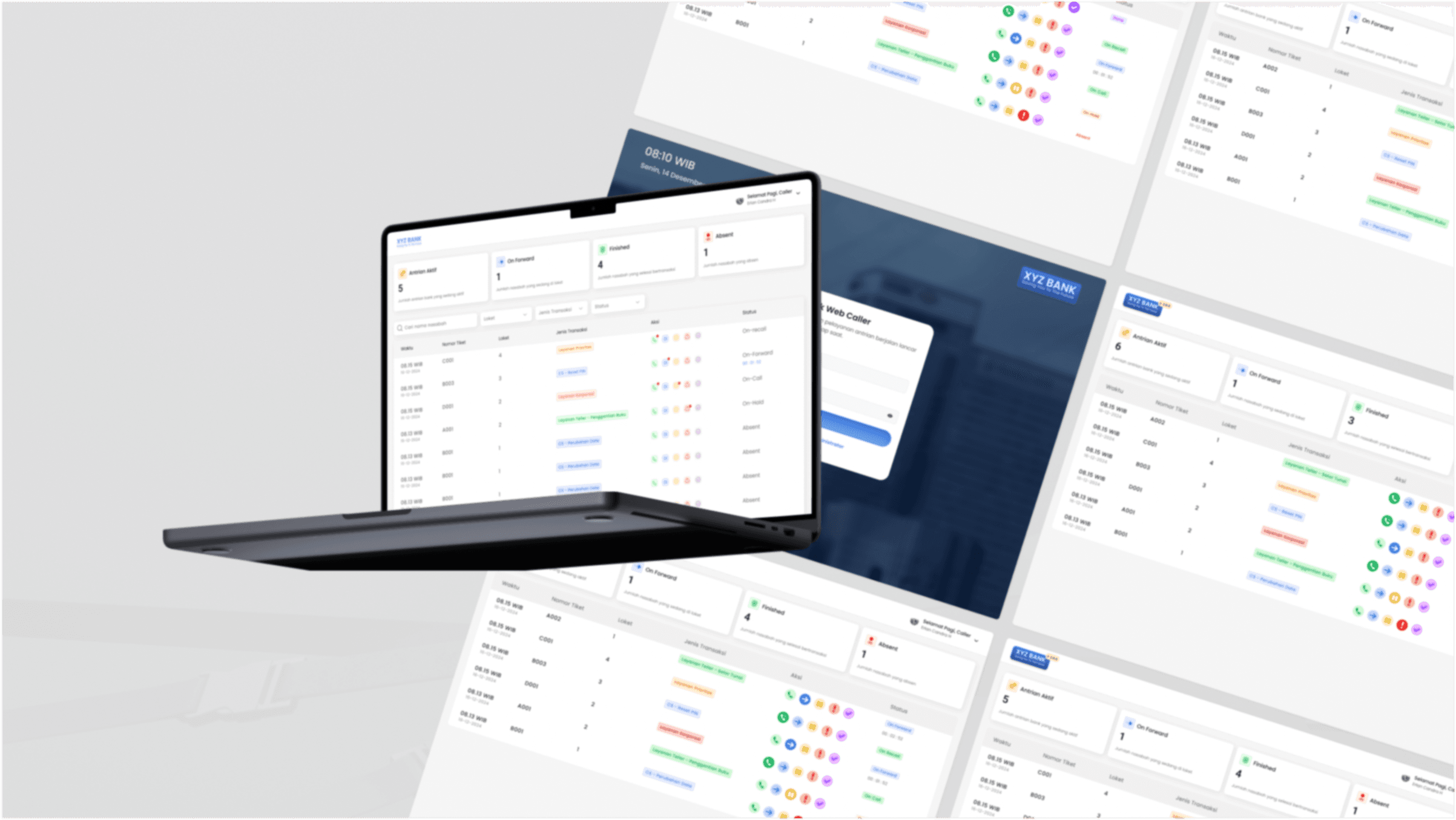
Behind the scenes, staff use a browser-based web interface to manage queues seamlessly.
🔍 What does it do?
Allows staff to call customers.
Enables prioritization and redirection to counters.
✨ The Impact
Staff can focus on providing high-value services while maintaining smooth queue operations
4. The REPORTING MODULE: Driving Insights with Data
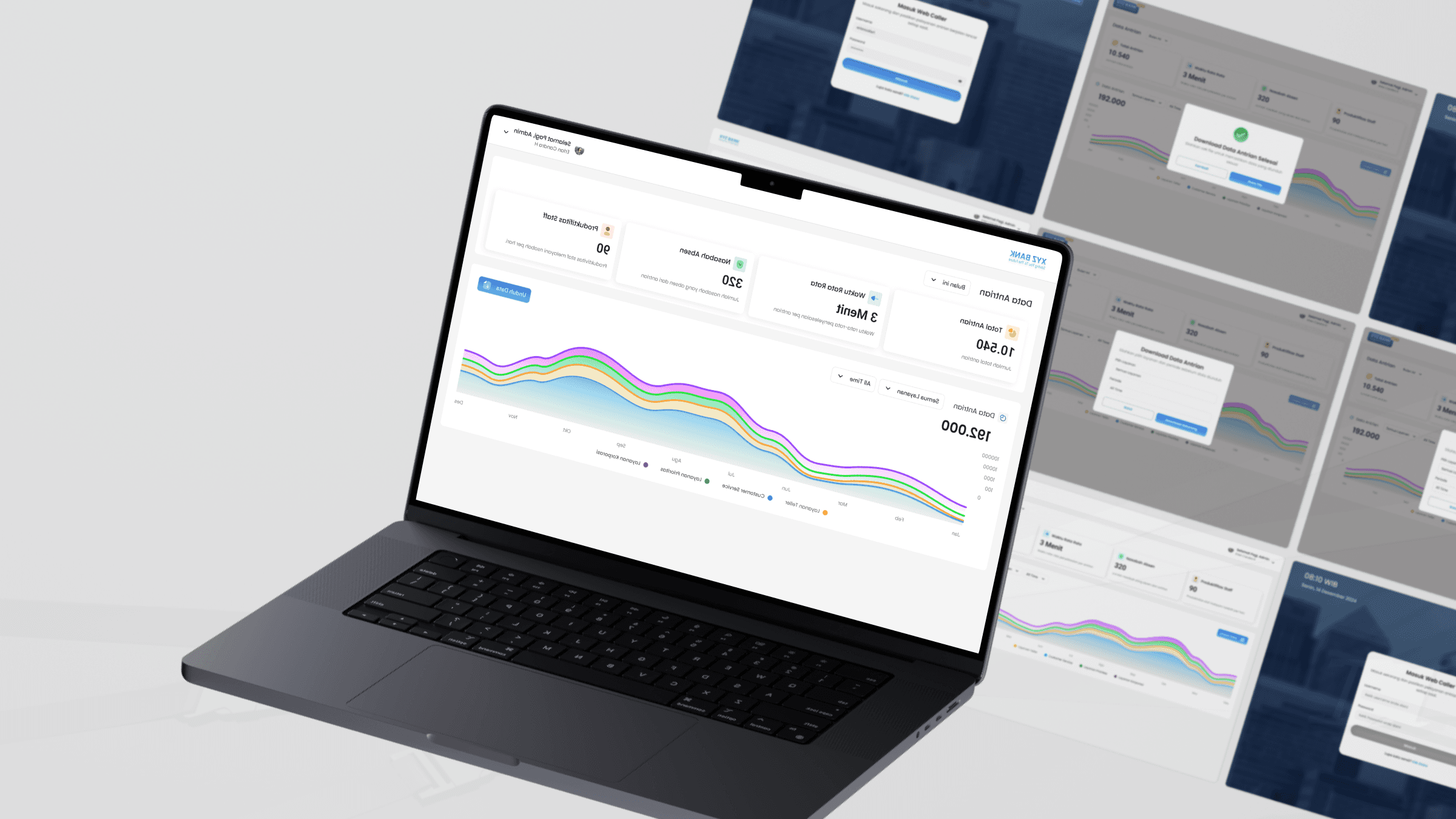
For administrators, the reporting module is a game-changer.
🔍 What does it do?
Tracks queue performance.
Identifies service demand trends.
Measures staff productivity.
✨ The Impact
Data-driven decisions ensure continuous improvement in customer service and branch operations.
Results and Takeaways
The OT KIOSK UI Design transformed Bank XYZ’s queuing process:
Reduced wait times by 35%.
Increased customer satisfaction scores by 20%.
Improved staff productivity with automated queue management.
This project showcased how thoughtful design and research could solve complex problems, creating a seamless experience for both customers and staff.
Final Reflection
Designing for Bank XYZ wasn’t just about creating screens; it was about crafting an experience that aligned with their commitment to excellence. With every tap, glance, and action, the OT KIOSK system brought clarity, efficiency, and satisfaction to the forefront.
This is how we turn vision into impact—one interface at a time.
Interested in creating a transformative solution like this? Let’s collaborate!